Over 6 months ago, work started with making Erik Johanssons new site. We’ve worked with Erik previously, and he has produced all of our staff images. After many long hours at design meetings we settled on a design that was minimalistic – and responsive.
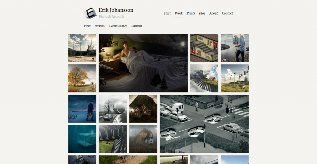
Our concept for Eriks portfolio was that he should be able to feature some images visually, but at the same time maintain a perfect grid of thumbnails without the headache of having to sort the images ”manually”. At the same we wanted to give mobile users a break – his old site wasn’t very cool to use with a smartphone. We combined the two, and voila! Self-sorting portfolio for desktop users, and big thumbnails for mobile users.
We also built special templates for his ”About” and ”Contact” pages, since he recieved lots and lots of work offers, and tons of magazines etc wanted to interview him. As such, he needed to filter some of the proposals he got to have time to actually work :). The work started on a new domain, since none of his english-speaking clients has some issues spelling ”Allt eller inget” (swedish for ”All or nothing”) that he uses as an adress today.
We wish Erik the best of luck with his new site! Visit erikjohanssonphoto.com